

Website Redesign
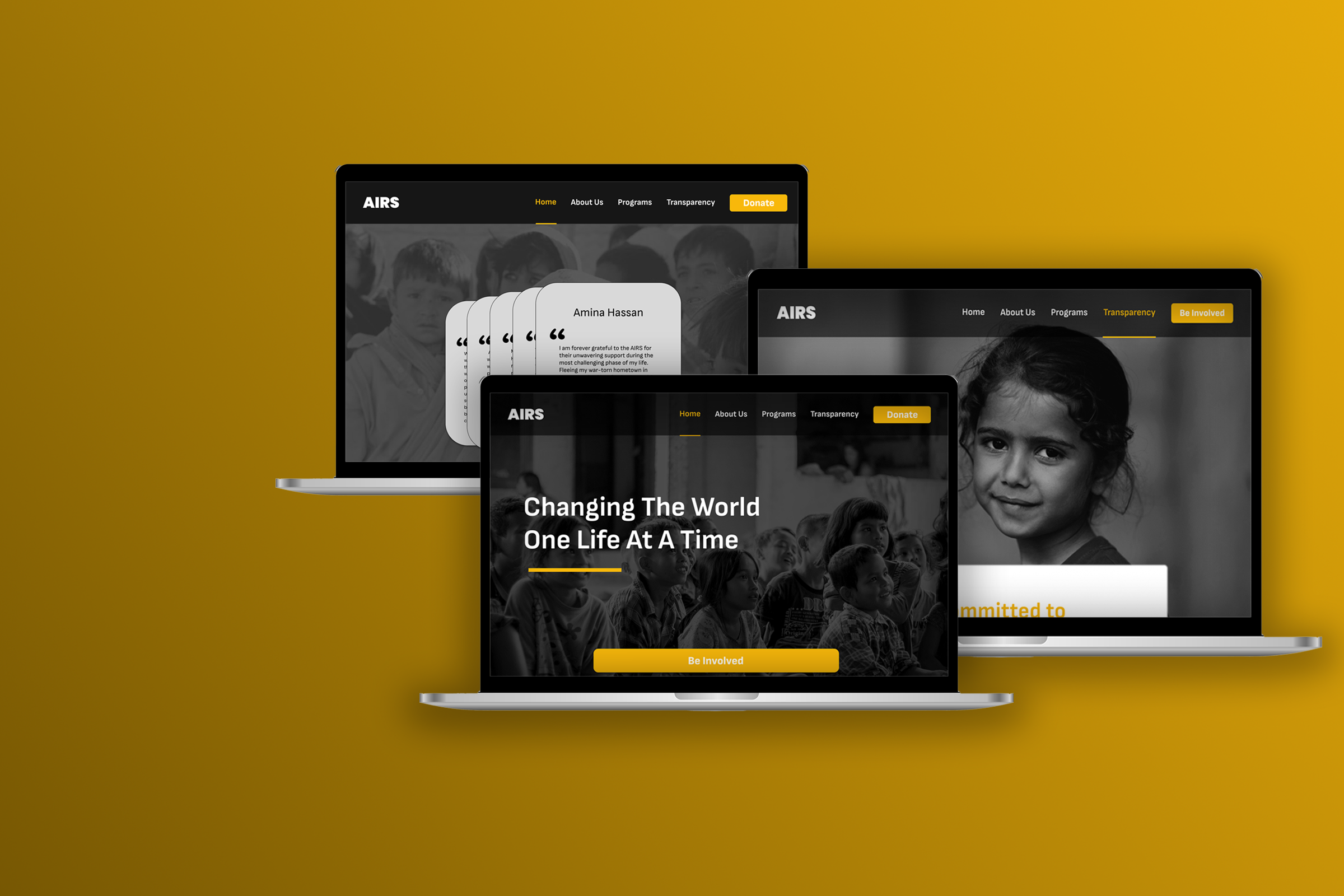
AIRS
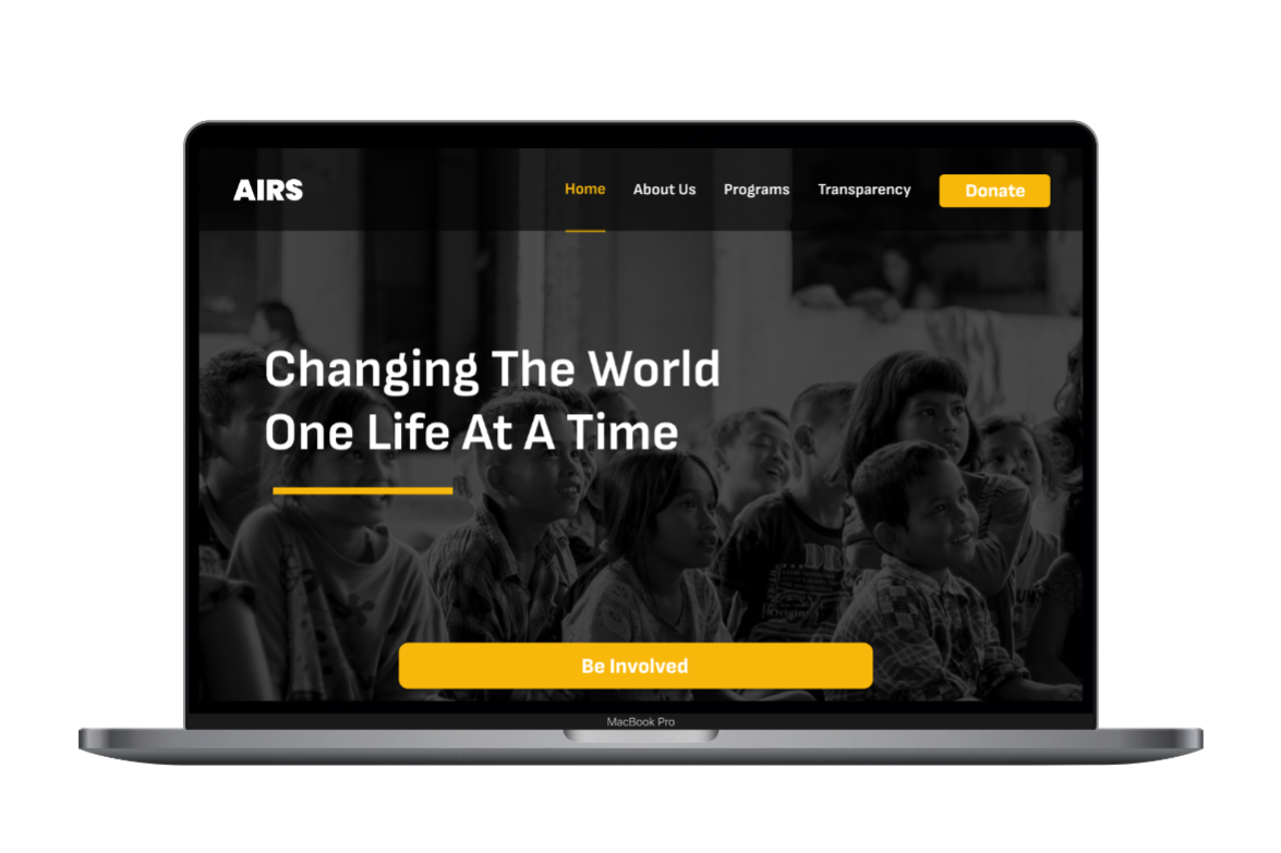
“AIRS” - Arizona Immigrants and Refugee Services, a dedicated non-profit organization aiding refugee resettlement and immigration services. Get a glimpse of the revamped website prototype below:

PROJECT TIMELINE
One Week

Academic | Group Project | Design Sprint
MY ROLE
UI Designer

TOOLS USED
Figma, Illustrator, Slack, Google Suite

PROJECT TYPE
1-Week Design Sprint
INTRODUCTION
This collaborative 1-week design sprint aimed at using design for social good, focusing on enhancing non-profit organizations’ outreach and impact. Our task was to select a non-profit and reimagine its website, with a focus on refining the landing page and donation process. With a team of four designers, we chose to redesign the Arizona Immigrants and Refugee Services’ (AIRS) website, accessible at www.airsaz.org. To guide our design process, we formulated a hypothetical problem space.
A decline in donations
PROBLEM SPACE
Over the years, AIRS has experienced a significant decrease in donations, leaving them perplexed about the factors driving this decline. Even with their determined dedication and impactful efforts to aid immigrants and refugees, the diminishing financial support raised concerns regarding the sustainability of their vital services and programs.
RESEARCH
Primary & Secondary
During our primary research, our team conducted an investigation on people’s donation behavior by asking questions like “Why do you donate?”, “What keeps you from donating to a cause?”. Here are four insights from people we interviewed that tell us about how they think:
“Seeing the results of an organization helping people is a good motivator for me to donate”
“Nothing assures whether my donation goes to a good cause”
In our secondary research, we discovered that:
Donors seek evidence of their donations’ impact and wish to understand their role in achieving outcomes.
Selecting the right organization to support can be challenging due to transparency issues in operations.
Donations made to charitable organizations may not always reach those most in need.
The main takeaway from this secondary research is that donors want donation transparency.
OBJECTIVE
Team Sprint Goal
“I like it when there is transparency on where to donate”
“Charities go on for a long time and things are still just as bad, I wish there was more things we impact that charities showed”
From the insights, we deduced that People would be more likely to donate if they see the impact their donation is making.
After thorough research, we have defined our ultimate goal for the product redesign process:

Providing donors with Pay Transparency in order to increase donations.
How Might We…
enhance transparency in donations for AIRS in order to provide donors with clear visibility into how their contributions are utilized?

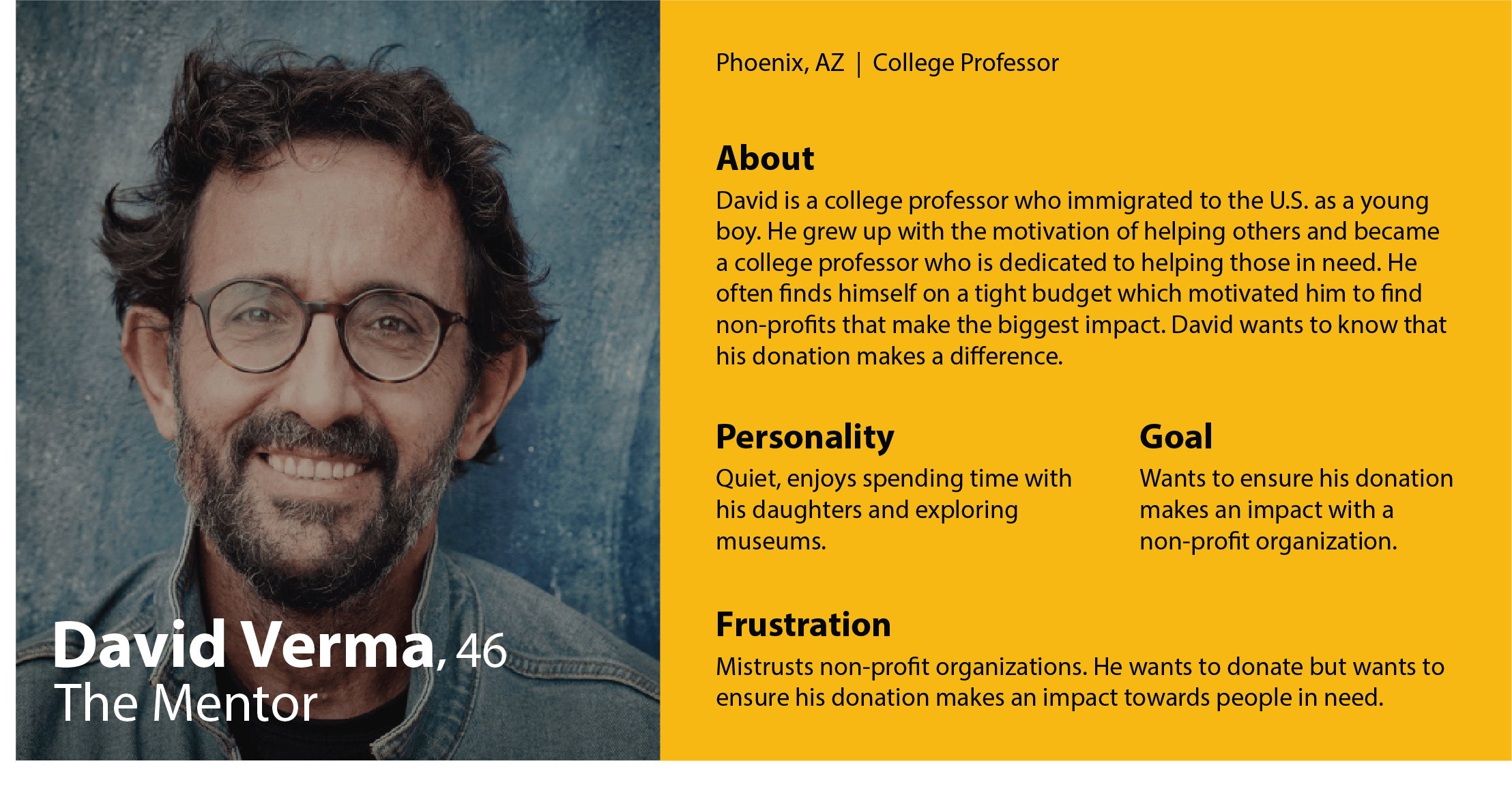
Knowing our target user
USER PERSONA
SKETCHES
Home Page

Meet David Verma, a 46 year-old college professor who will serve as our user persona.
Our chosen wireframes
With the research, objectives, and user persona in mind, we delved straight into the ideation process. We put our ideas on paper, sketching out potential solutions, and decided on the below wireframes to move forward with.
CLICK IMAGES TO ENLARGE
Testimony Page
Donation Page
MOODBOARD
A light in the darkness
As depicted below, our chosen color palette consists of achromatic shades, with a subtle infusion of yellow. This touch of yellow represents the “light in the darkness”, symbolizing the hope and illumination that the services offered by AIRS bring to refugees.

UI INSPIRATION
#F9F9F9
For Titles:
Colors
#000000
Fonts
For Paragraphs:
Inspiration ignites creativity
CLICK IMAGES TO ENLARGE
#373737
#F8B80B
#ABABAB
#CF9701
Laila
Sofia Sans
Before presenting the final prototype, let me take you through the interface inspiration that fueled our creative process and informed the redesign of the AIRS website. These sources of inspiration were drawn from websites of various charity organizations.
PROTOTYPE ITERATIONS
Iterate, iterate, iterate…
During the design process, we underwent two primary iterations, conducting a round of testing between them. The visual overview below illustrates how user feedback influenced the changes made from the first to the second iteration in our design.
Home Page
Testimony Page
Donation Page
Key Findings
USER TESTING
After the first iteration, we remotely conducted a qualitative user testing with five participants to assess the understandability of the redesigned website and the ability to perform tasks. Throughout the testing phase, participants were tasked with actions such as making a donation or visiting specific pages of the redesigned website. We observed their interactions and recorded their feedback. Here is a summary of their feedback and our responses:

Aesthetic
First Iteration
Test users admired the website’s appearance, user-friendly interface, and visual appeal. Besides that, they found some of the interactions less intuitive. To address this, we added instructions on the Testimony page to guide users on how to interact with testimonials by ‘Clicking and dragging right’

CLICK IMAGES TO ENLARGE
CLICK IMAGES TO ENLARGE
CLICK IMAGES TO ENLARGE

Home Page
Some users preferred testimonials on the home page rather than having a standalone Testimony page. To accommodate this, we included snippets at the bottom of the home page, directing readers to the full testimonials on a dedicated Testimony page.
Second Iteration

Wording
Terms like “Be involved” and “Transparency” were unclear to some of our test users. “Be Involved” lacked clarity in its purpose, leading us to replace it with “Donate”, which clearly communicates its function.
HIGH-FI PROTOTYPE
Introducing AIRS
Allow me to introduce you to our collaborative one-week effort, resulting in the redesign of the AIRS website. This redesign is a testament to our commitment to enhancing user experience and ensuring that AIRS continues to be a beacon of hope for immigrants and refugees in need of support. I invite you to explore it.
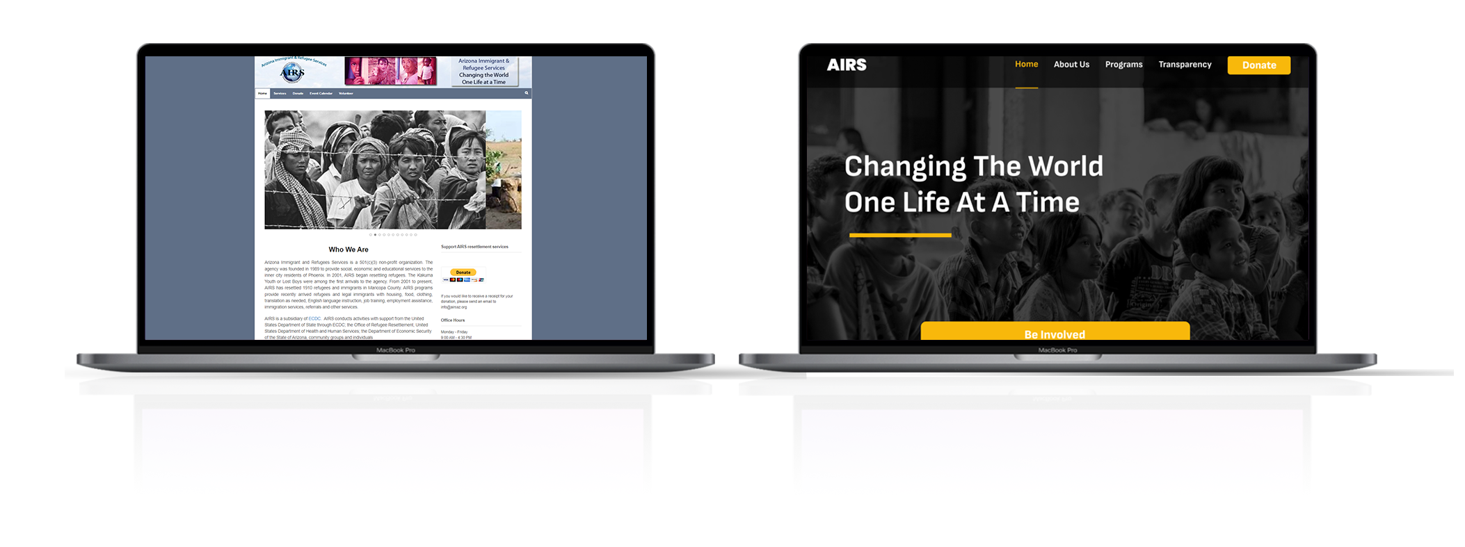
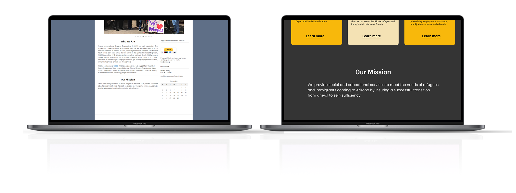
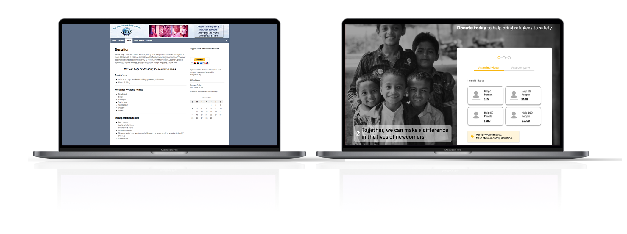
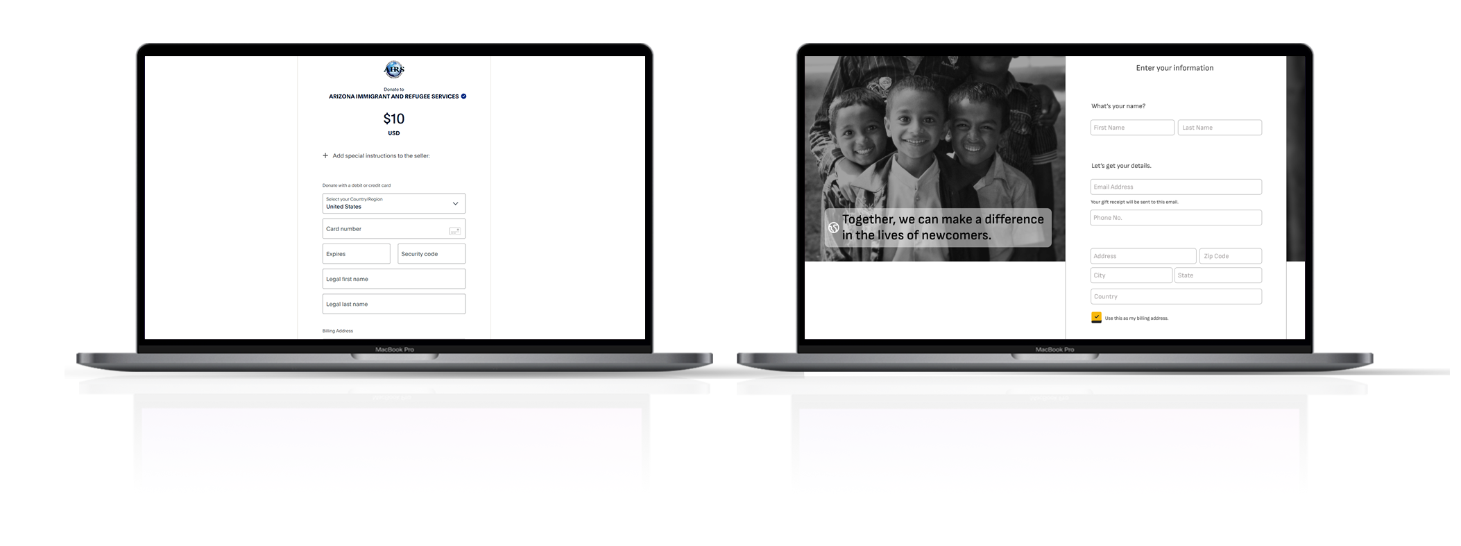
SIDE-BY-SIDE COMPARISON
Before and After
Take a side-by-side look at the redesign compared to the original website (airsaz.org). In the carousel below, the initial site is presented on the left while the redesigned website is displayed on the right.
KEY LEARNINGS
Lessons learned from the project
Working on this project has provided me with valuable insights into the intricacies of charitable donations and the underlying motivations that drive people to contribute to diverse causes. I learned for example that while financial capacity plays a role, the primary element that drives people to donate is the assurance that their contributions create a meaningful impact. Unfortunately, the allocation of funds within charitable organizations often lacks transparency, leaving donors uncertain about how their donations are utilized. This lack of clarity can lead to skepticism and hesitancy in supporting charitable initiatives.
Therefore, it is most important that individuals advocate for greater transparency and accountability in the use of funds donated to charitable organizations. By doing so, people will trust more in charities and feel encouraged to contribute more to worthwhile causes.